
a) Recording the evidence
In most school investigations, the evidence/data is recorded on a results table.
It is not an absolute requirement in the scientific world to use a table but it is a requirement in school assessments.
A table is the first step in organising your data. However, it does not easily show trends and patterns.
To draw a good results table:
*You need to be clear about your variables (dependent, independent and control).
*You also need to have a clear idea about how much evidence you need to collect.
How much evidence do I need?
-It depends! Remember this does not refer to repeats but to the 'sets of data'. It really depends on the question you want answer.
*As a guide, you must collect enough evidence to help you draw a chart and identify a meaningful pattern.
-Such a pattern can be identified with 5 or more readings.
The results table
-As said before, this organises the data but does not help you see any patterns or variations.
*Your table should show both the dependent and independent variables.
General guidance for results tables
This may seem silly, but some students mistake a table and a graph. So that you do not forget, think of a table as used at home- it has a horizontal flat surface and vertical legs. So is a table in science it has horizontal lines marking rows and vertical lines marking the columns.
Exam standard tables have to meet these requirements:
*Ruled lines and a border
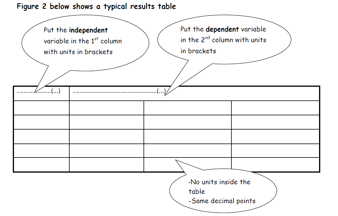
*Independent variable with units (in brackets) in the first column (on the left)
*Dependent variable with units (in brackets) in the second and subsequent columns (to the right)
*Informative column and row headings. What does this mean? It means a full description of the dimension of the variable you are talking about:
e.g. 'time' and 'time taken' are not enough. Instead use: 'time taken to complete the exercise (min)'
-There should be no units inside the table! You have already put them in the headings, so why repeat? Waste of time!
*Do not mix units in the table, for example, seconds and minutes.
*Record all data to the same number of decimal places.
To summarise:
*The guidelines are that your independent variable (the one that you can change or fix) goes into the first column.
*The dependent variable (What you measure) goes in the second column, which you can divide into whatever number of intervals you want.
For consistency and maintaining the same level of precision, we use the same number of decimal points inside the table and we do not mix units, for example, do not use metres and centimetres.
Naming the variables on the table
-You need to be precise when naming your variables on the table, otherwise you will lose some marks in assessments.
i. For objects and things that can be counted individually- use Number of ...
ii. For objects that cannot be counted individually- use amount of ..., weight of ...
iii. For measurable entities, use the name of the scale that is used to measure them - mass of..., weight of..., volume of ..., temperature of ...
*Avoid using terms that are imprecise like ... size of ... Size can be measured using different dimensions e.g. height, mass, area, volume etc. so the examiner does not know which one you mean.
Figure 2 below summarises how you should present your table:
2. Graphs and Charts
Why should we draw a graph or Chart?
*Graphs and charts are usually drawn to let us easily identify trends or patterns
A graph:
- condenses the data,
- makes it compact and
- lets us see the ups and downs and relationships between the variables
What kind of graph should I draw Miss/ Sir?
This is indeed one of the most common questions students ask during investigations or controlled assessments. Unfortunately Sir can't tell you the answer during controlled assessments. The answer is not in Sir or Miss's head, let us work it out and you will never ask this question again.
* Graphs are drawn according to one's judgement as to what chart or graph will best show what they want to show. We can use the independent variables as guidelines to help us.
If your independent variable is:
* Numeric or continuous (these can be any number value) - These are best shown using a line graph.
* Categoric (mostly expressed in words or stand alone categories) - These are best shown using a bar chart.
So with these 'rules of thumb', the answer is no longer in Sir's head but in ours. The key is in identifying which one is your independent variable and checking if it is categoric or continuous.
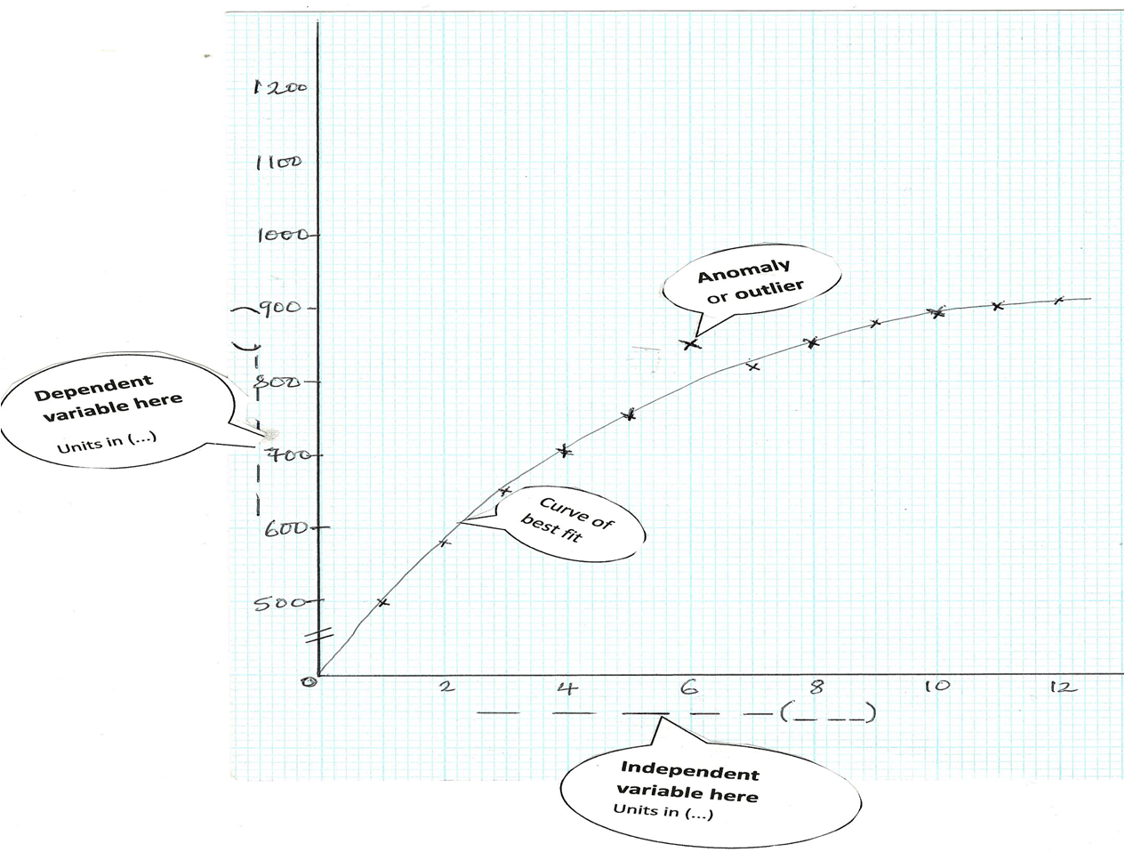
Below is an example of how to draw and present a line graph: